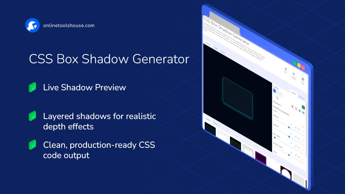
CSS Box Shadow Generator
Designing CSS box shadows doesn’t have to be a guessing game. This visual generator helps you build beautiful shadows with ease - no need to tweak values blindly. Just drag sliders, preview the result in real time, and copy the final CSS code when you're happy with the result.
Build Stunning CSS Box Shadows Without Writing Code
Whether you need a soft card shadow or a bold glowing block - this tool gives you full control over every detail of your design. Perfect for developers, designers, or anyone learning CSS.
Features and Possibilities:
- Multiple Layers: Stack as many shadows as you want to create complex, layered depth or lighting effects.
- Live Preview: See every change in real time as you adjust the blur radius, offsets, colors, or switch between inset and outset modes.
- Visual Sliders & Pickers: Control all key properties - offset X/Y, blur radius, spread, shadow color - without touching code.
- Inset Option: Easily switch shadows to appear inside the box for that pressed or inner-glow look.
- Block Customization: Change the size, border radius, border style, and background of the preview block to simulate real-world use.
- Layout Modes: Preview your shadow in a layout context - block, header, footer, or sidebar.
- Custom Background: Test shadows against different backgrounds - choose a solid color, upload your own image, or use one from the site gallery.
- Presets: Start from curated shadow presets and customize further.
- Save & Reuse: Save shadow configurations to your device or browser’s localStorage. Open them later in a single click.
- Copy Clean CSS: Once you’re happy with the result, grab ready-to-use CSS with no clutter.
How to Create CSS Box Shadows Visually
You want to create a custom shadow for your UI elements. This tool lets you design shadows visually and get clean CSS instantly. Just adjust settings and copy the result into your project.
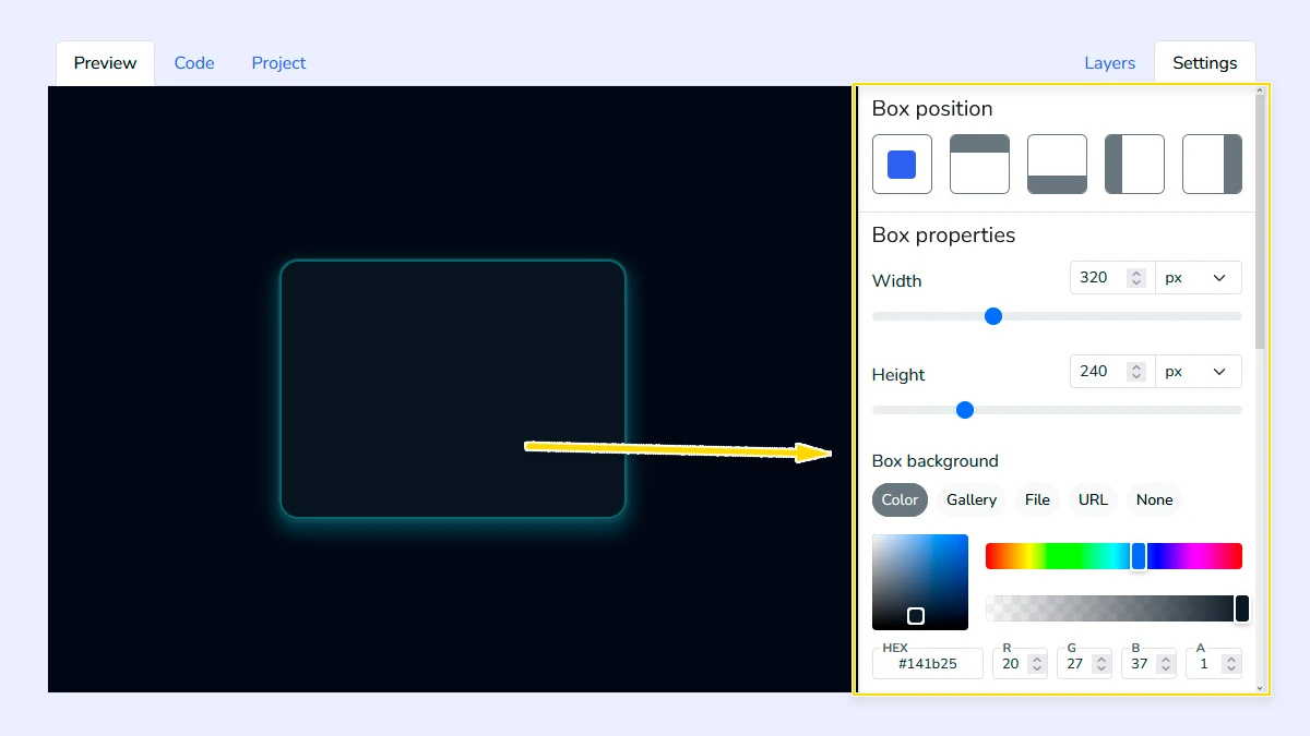
Customize Block Appearance1
Open the "Settings" tab and configure the block appearance: choose layout type (header, footer, sidebar, block), set size, background, border radius, and border styles. You can also change the background behind the block to test how the shadow interacts with different surfaces.
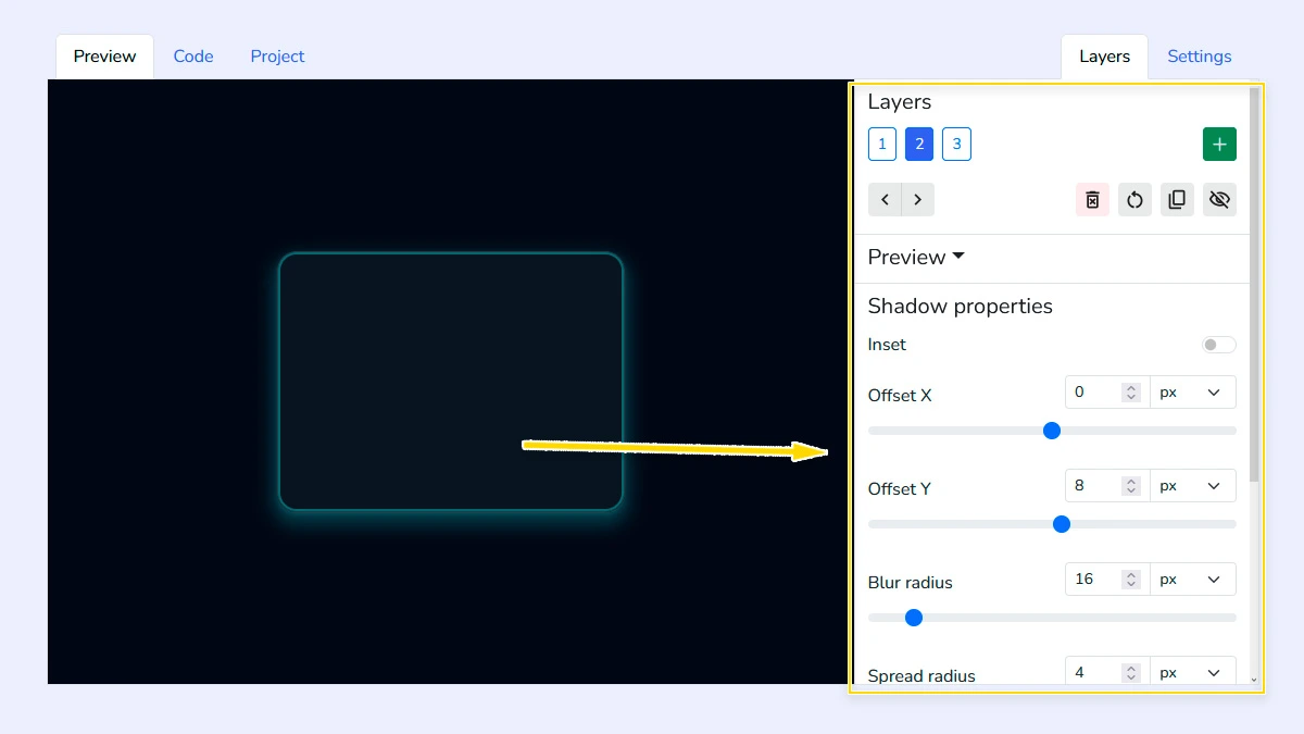
Configure Shadow Layers2
Add and manage multiple shadow layers to create complex effects. Adjust offset, blur radius, spread, color, and inset option. You can reorder or remove layers to fine-tune the final result.
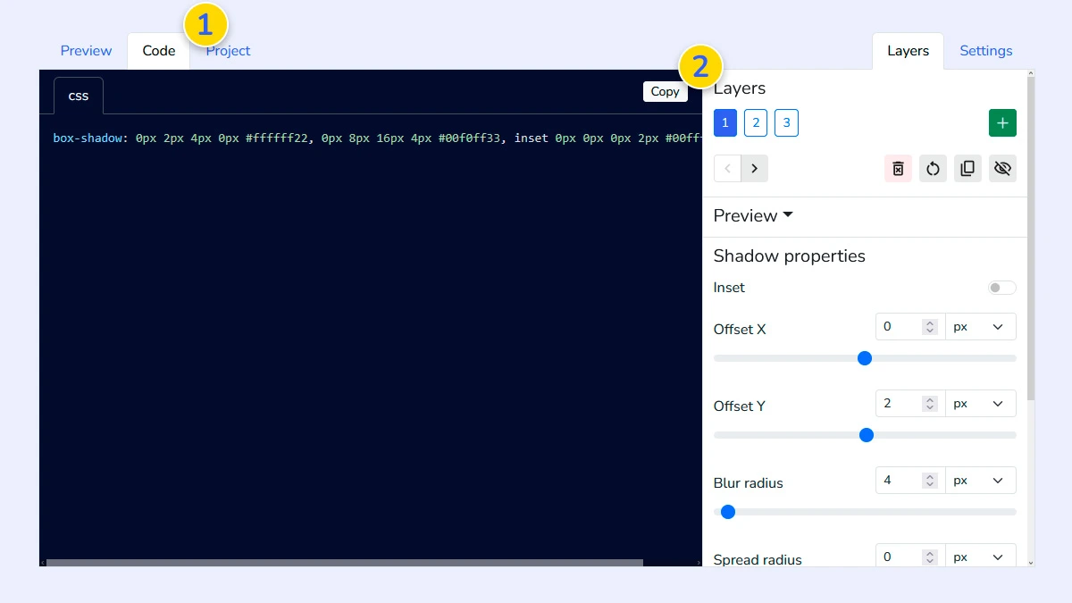
Review and copy CSS3
Switch to the Code tab 1 to see the generated properties for all layers. Simply click copy 2 to get the production-ready CSS code for your project.
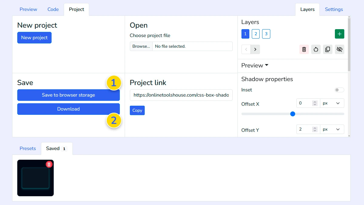
Save and export project (Optional)4
Save your configuration to browser memory 1 or download it as a file 2. This allows you to reload and edit your shadow project anytime you need.
FAQ
Can I create inner shadows?
Yes, use the "Inset" toggle in the shadow properties to flip the shadow inside the block.
Can I create multiple shadow layers?
Yes. You can stack and customize multiple shadow layers.
How many shadow layers can I add?
You can add an unlimited number of layers to create complex "smooth" shadows or glowing effects.
Are the shadows compatible with all browsers?
The tool generates the standard box-shadow property which is widely supported by all modern web browsers.
Can I test shadows on my own background?
Yes, you can upload your own image or set a custom background color in the Settings tab.