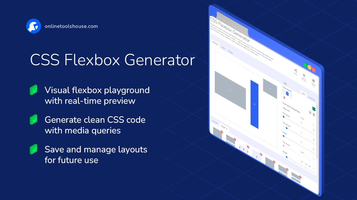
CSS Flexbox Generator
Designing modern layouts with flexbox doesn’t have to be hard. This online generator helps you build responsive designs visually - adjust properties, preview results, and copy valid CSS instantly. It also supports media queries for different screen sizes.
Create Flexbox Layouts Visually and Effortlessly
Flexbox is one of the most powerful layout tools in CSS - but remembering all the properties and syntax can be tricky. This online flexbox generator helps you build layouts faster and smarter. Perfect for developers, designers, and anyone learning CSS.
Features and Possibilities:
- Visual Layout Editing: Adjust flex-direction, justify-content, align-items, gap, and more - with intuitive sliders and dropdowns.
- Real-Time Preview: Watch layout changes as you adjust properties for the container or individual items.
- Item Controls: Modify each item's grow, shrink, basis, order, and alignment settings.
- Responsive Design: Easily add media queries to change layout behavior on different screen sizes.
- Templates & Presets: Start with pre-made flexbox layouts - headers, sidebars, footers, and more.
- Save & Reuse Projects: Save your configuration to your device or local storage and come back to it later.
- Clean CSS Output: Get ready-to-use, well-formatted CSS code - just copy and paste into your project.
How to Create Flexbox Layout Online
You want to build a responsive layout using CSS flexbox without writing code. This tool lets you visually configure container and items and get clean CSS code. Just adjust settings and copy the result for your project.
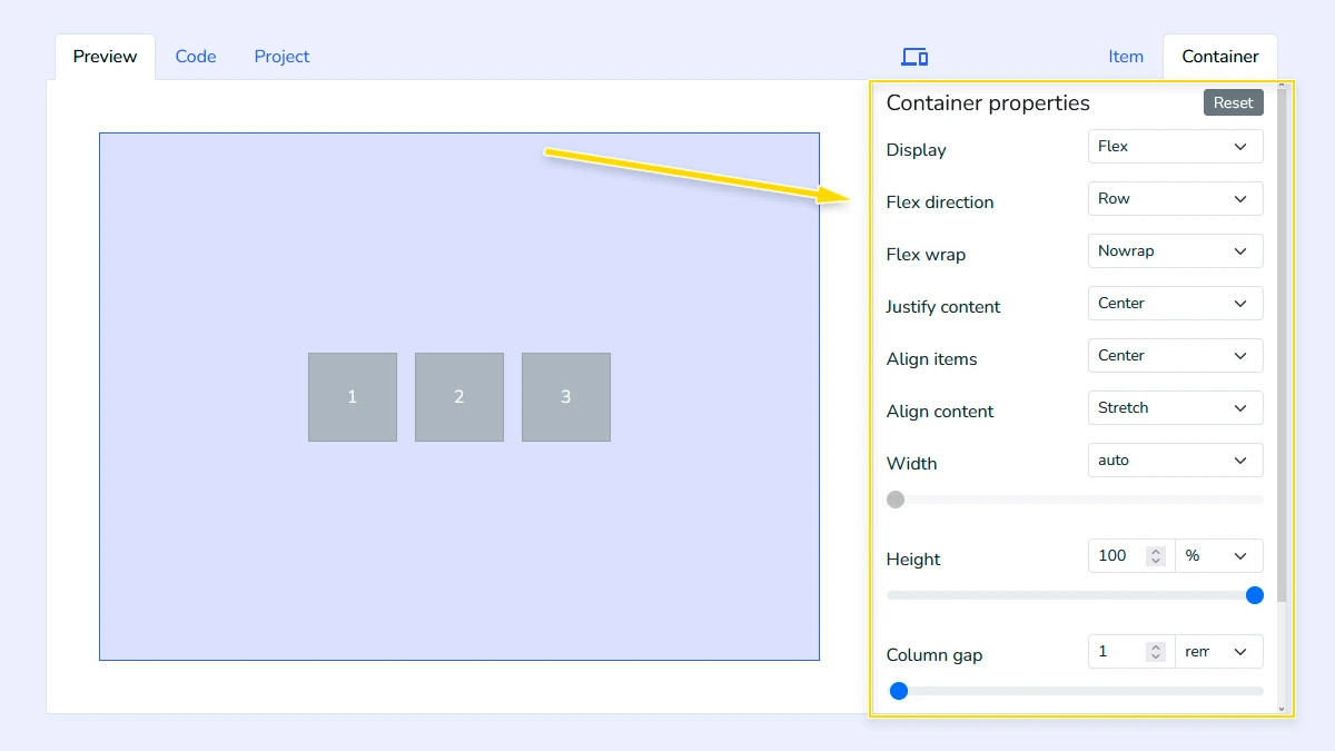
Configure Flex container1
Set up the main flex container by adjusting properties like display, flex-direction, flex-wrap, width, height, and gap. These settings define how items are arranged and spaced inside the layout.
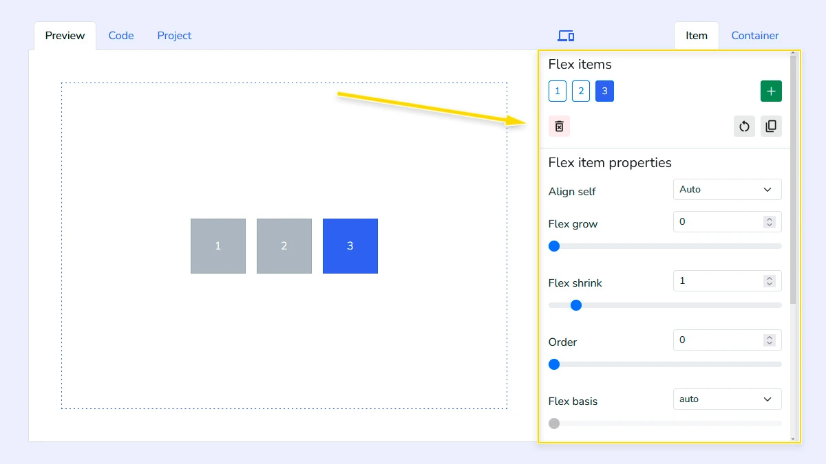
Adjust Flex Items2
Manage individual item properties such as flex-grow, flex-shrink, flex-basis, width, height to control how elements behave. You can also add or remove items to match your specific design requirements.
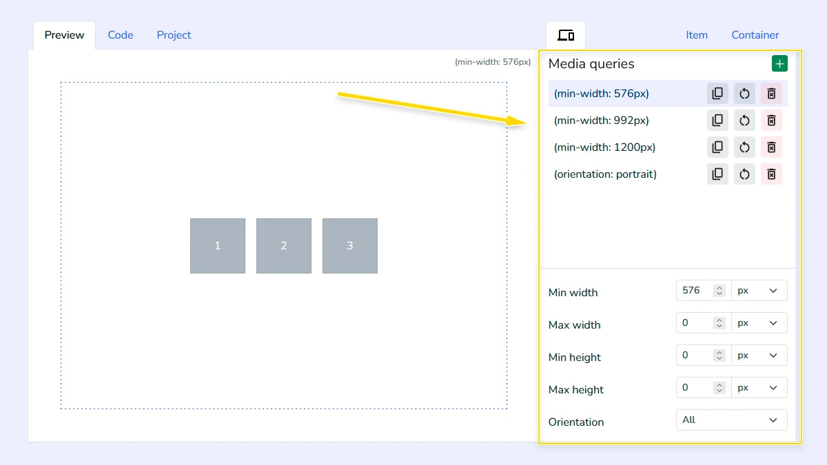
Add responsive media queries (Optional)3
Configure different container and item settings for various screen sizes using media queries. This allows you to create responsive layouts that adapt to mobile, tablet, and desktop views.
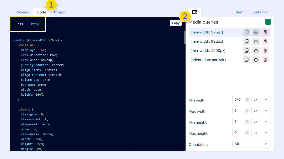
Copy CSS & HTML Code4
Open the "Code" tab 1 to see the generated CSS and HTML. The code is clean, formatted, and ready to use - just copy it 2 and paste into your project without any extra changes.
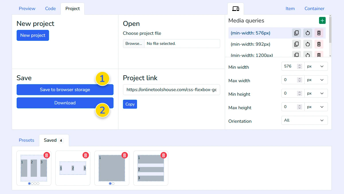
Manage your projects (Optional)5
Use the Project tab to save your layout configuration to the browser memory 1 or download it as a file 2. This allows you to reload and edit your design anytime in the future.
FAQ
Does it support all Flexbox properties?
Yes, it includes all standard properties for containers and items, including gaps and alignment options.
Can I create responsive layouts?
Yes. The tool supports media queries for different screen sizes.
Is the generated code clean?
Yes. The generator produces well-formatted, production-ready CSS code without unnecessary properties or bloat.
Do I need to know flexbox to use it?
No. You can adjust settings visually and learn flexbox as you go.