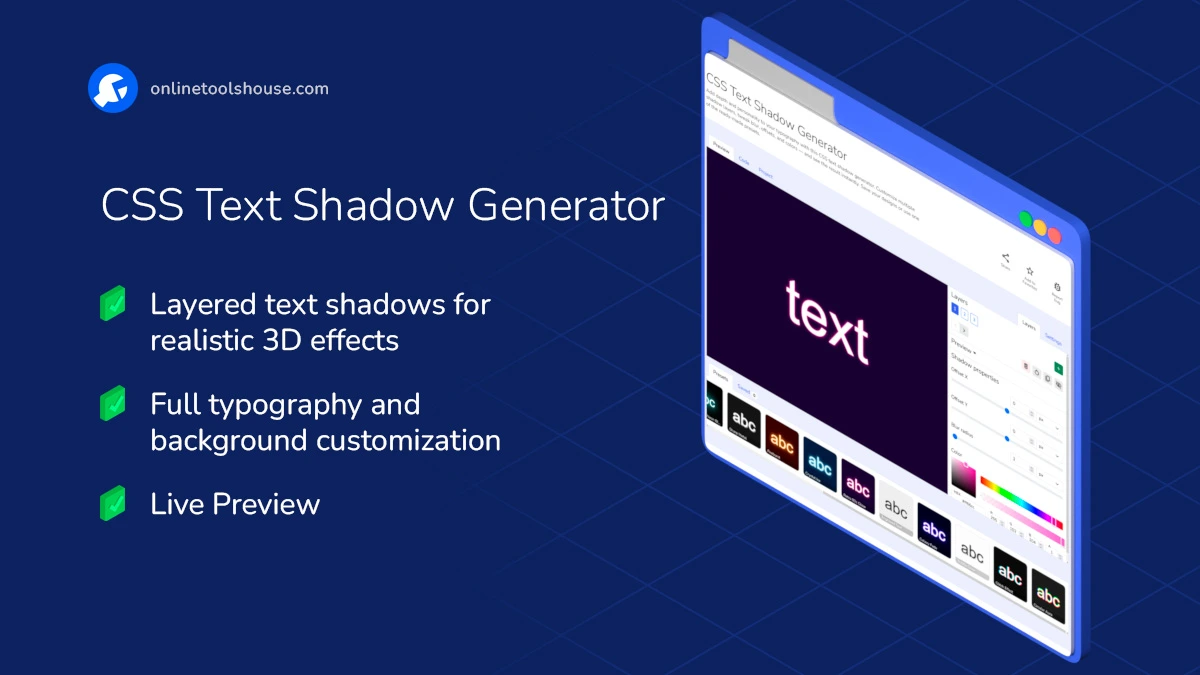
CSS Text Shadow Generator
Add depth and personality to your typography with this CSS text shadow generator. Customize multiple shadow layers, tweak blur, offsets, and colors - and see the result instantly. Save your designs or use one of the ready-made presets.
Design Better Text with Custom CSS Shadows
Want to add subtle depth or dramatic contrast to your text? This online CSS text shadow generator helps you create eye-catching effects in just a few clicks - no manual CSS coding required.
Whether you're experimenting with soft shadows or building complex layered effects, this tool gives you full control.
Features:
- Live Preview - Instantly see how your shadow looks as you adjust it.
- Multiple Layers - Stack as many shadows as you want for complex designs.
- Fine Controls - Offset X/Y, blur radius, shadow color.
- Text Styling - Set font size, family, weight, style, decoration, and color.
- Background Options - Use solid color, image upload, or URL-based backgrounds.
- Save Projects - Store your favorite styles in localStorage or download them.
- Presets Gallery - Pick from curated shadow styles to get started faster.
This tool is perfect for developers, designers, and students who want to fine-tune the visual impact of their text directly in the browser.
How to Create CSS Text Shadows Visually
You want to add shadow effects to your text. This tool lets you style text and shadows visually and get clean CSS. Just adjust settings and copy the result into your project.
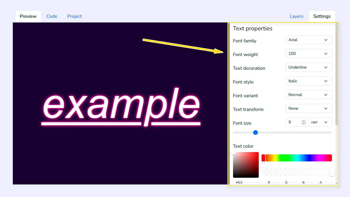
Configure font and background1
Open the "Settings" tab and configure text styles like font-family, font-weight, size, decoration, and color. You can also set a background color or upload an image from your device, URL, or gallery to test visibility.
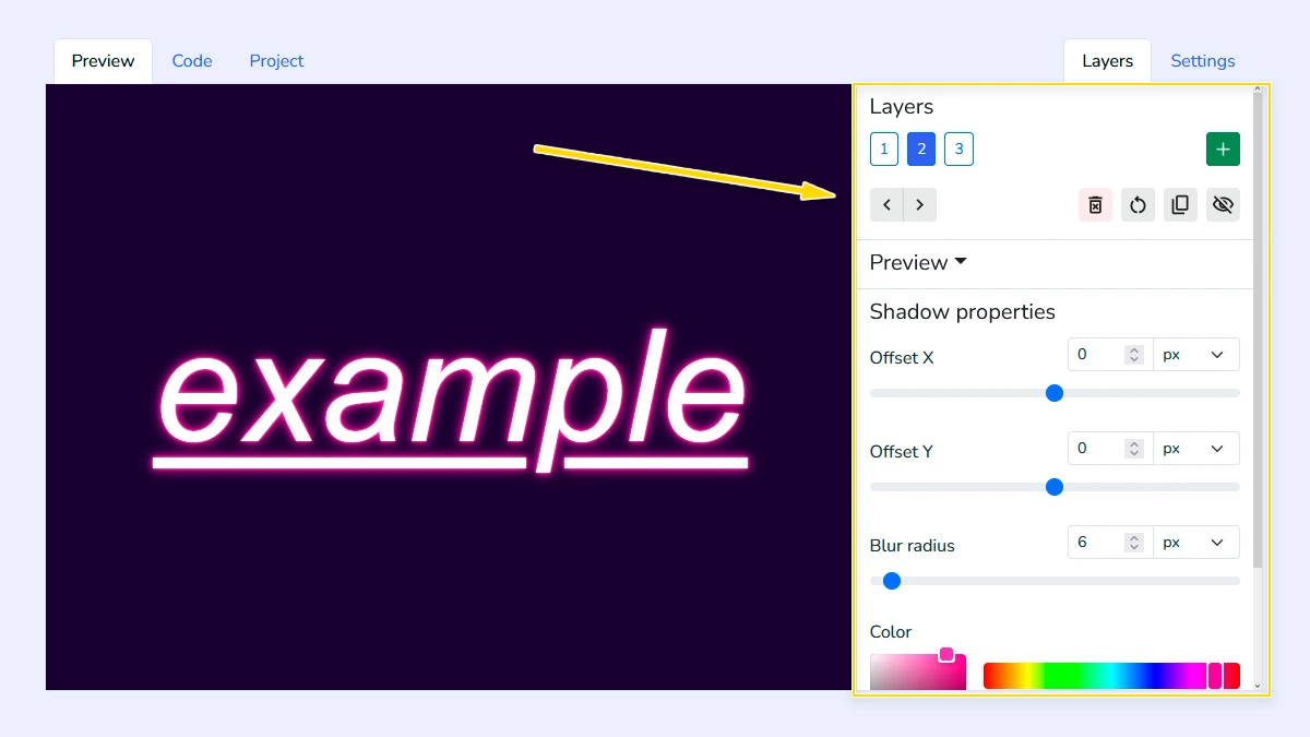
Configure Shadow Layers2
Add multiple shadow layers and adjust their offsets, blur, and color. You can easily reorder or remove layers to create complex effects like neon glows or sharp retro typography.
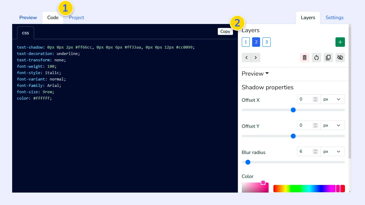
Copy CSS Code3
Open the "Code" tab 1 to view the generated CSS. The code is clean and ready to use - just copy 2 and paste it into your stylesheet without extra changes.
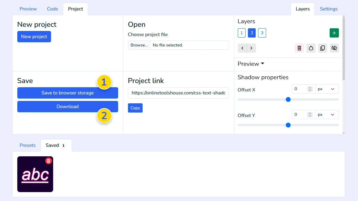
Save project (Optional)4
Open the Project tab to save your design to the browser storage 1 or export it as a file 2. This allows you to reload and edit your custom text shadow configuration at any time.
FAQ
Can I create multi-colored shadows?
Yes, you can add multiple layers, each with its own unique color, offset and blur radius.
Is the text-shadow property compatible with all browsers?
Yes, it is a standard CSS property supported by all modern desktop and mobile browsers.
Can I test it on my own background image?
Yes, in the Settings tab, you can upload your own image or paste a link to see how the text looks.
Can I style the text itself?
Yes. You can control font, size, color, and more.
Can I insert my own text?
Yes. You can insert your text by clicking on the text in the preview window.